This is the link to the final version of the website.
http://bmthehorizon50.wixsite.com/website
This is a screen recording I created to demonstrate the different pages and looks of our website.
Showing posts with label Website. Show all posts
Showing posts with label Website. Show all posts
Tuesday, 4 April 2017

Wednesday, 15 March 2017
Website: New Merchandise!

The wolf I got from tumblr from someone who had drawn it. I thought it was the ideal picture because it was combined with grey and blue colors compared to loads of other wolves that were drawn in pencil or with pink reddish color.
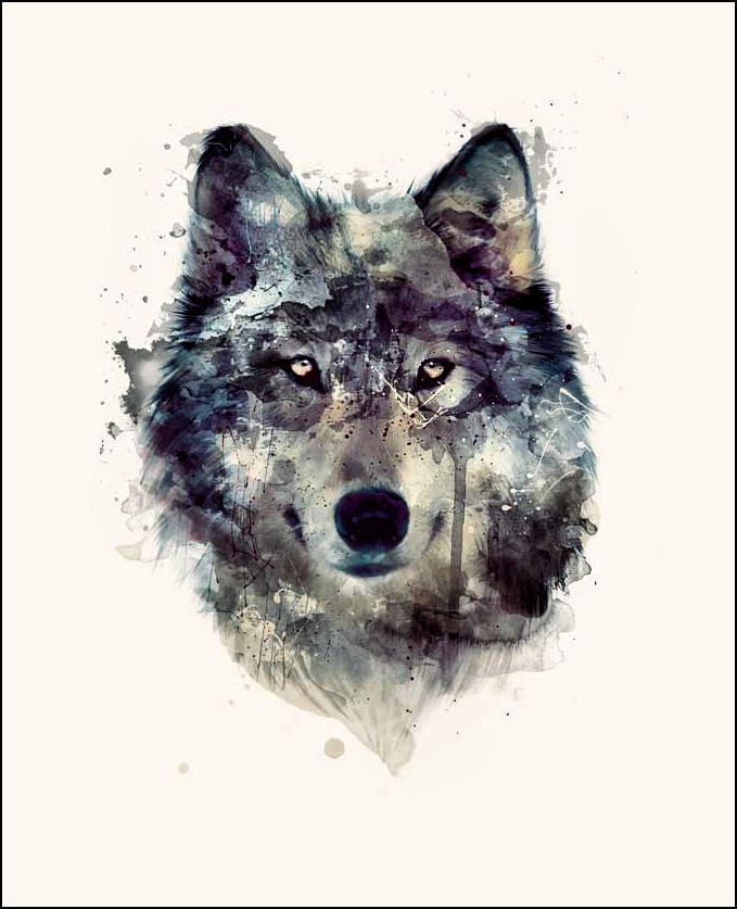
Below you can see a timelapse of how I created it.
This is a screen recording I did, while creating the T-Shirt, it was also a fundamental Tutorial of how to use the basic tools of Photoshop.
Friday, 3 March 2017
KO: WEBSITE: More merchandise
We have added 3 new merchandise for our website, Bronwen created two: the dog tags and a snap-back hat and I created a "That's The Spirit" vinyl. I also change the layout of the merch page so there are 3 products on each row and doing this is fixed a problem we had with the phone covers not showing what color they where as it was previously cropped but changing the layout fixed this. We are still planing to add more merch the main one being the Digipak.

The design for the Vinyl was inspired by the actual "That's The Spirit" Vinyl. The actual vinyl has the name of the album so what I did when I created it I added the logo Bronwen created and filled the cover of the vinyl with the logo.


Wednesday, 1 March 2017
Website: More Changes!

Today I wanted to work more on the texts of the website and add some things after we had gotten feedback from our teacher.
I added to the band biography and wrote about all of their albums right from 2004 up until 2015 and their tour, which they are doing 2016/2017.


Sunday, 15 January 2017
WEBSITE: Changes
Today, we had a photoshoot with our band members and I wanted to put up the new pictures and edit our website.


In the links list called "About the Band", I made quite a lot of changes. Firstly, I added the new pictures of the band members and in the near future I also intend to add a small bibiliography or quote from the individual band member. Also it says "About the Band" on the top of the page, where Wix had invented a small text below the title for it to look more realistic. My job has been to change these texts including the band bibliography and the official website text. Today I therefore changed the text beneath the title and I added the new picture of our band.

The text says the following: In 2004, Sykes formed Bring Me the Horizon, a band which rose to fame very quickly.
The band released their debut album Count Your Blessings in 2006. Their second album Suicide Season
was released on September 29, 2008 and their third studio album There is a Hell. Believe Me,
I've Seen It. There is a Heaven, Let's Keep It a Secret on October 4, 2010 and
they released their fourth studio album Sempiternal on April 1, 2013 which feature the new member
Jordan Fish and Sykes playing rhythm guitar
for the album and they released their fifth studio album That's the Spirit on September 11, 2015.

 Furthermore, I decided to change the layout of the first page of our official website, since I thought that it was difficult to read the white font on the picture of the band but even with just the logo behind it. Therefore I ended up with a black background where the fond is easily readable and you can see a picture of the band with all of it's band members. The text says:
  Only a year after starting out as a band, Bring Me The
Horizon gained significant attention! Composed of a group of 5 inspirational
musicians and skillful performers, the artists behind Bring Me The Horizon have
throughout the last 12 years earned their reputation as a talented metal core
band. By also winning the awards for Best British Band twice and Best Album,
BMTH are internationally admired by millions of fans for their distinct and
enjoyable musical style. Explore the site and check out their music, tour dates
and merch below.
Only a year after starting out as a band, Bring Me The
Horizon gained significant attention! Composed of a group of 5 inspirational
musicians and skillful performers, the artists behind Bring Me The Horizon have
throughout the last 12 years earned their reputation as a talented metal core
band. By also winning the awards for Best British Band twice and Best Album,
BMTH are internationally admired by millions of fans for their distinct and
enjoyable musical style. Explore the site and check out their music, tour dates
and merch below.
I also decided to add a gallery with a scrolling through rather than just that one image. Now there are images of the band that automatically appear and change after a few seconds, but also it is advertising for the newest merchandise. I put a picture up of the new merchandise (white T-Shirt), where I then added a link that the audience could click on and would automatically be re-directed to the merch site.

In the future I intend to add a picture of an upcoming concert, where the audience can click on one button where it says "buy tickets here", that then re-directs them to the official BMTH tour dates and places they can buy tickets. I believe that small tricks like these make the website appear more realistic and can also attract a wider audience.
Friday, 16 December 2016
KO: WEBSITE: Merchandise
WEBSITE: Merchandise
For our website we created a merch site. In the merch site you can choose to buy merchandise that we have created for the band Bring Me The Horizon. Bronwen created the logo for the band as well as created the merch. At the moment we have six different merch items, 2 iPhone cases (black, white), 2 T-Shirts with a heart on it (Black, White) and 2 T-Shirts with the logo on (a small logo and a big logo). The reasons for using iPhone cases is beacuse most people own an iPhone and cases are very useful and because they are so small and cheap they are very often bought by fans.

When you first open the merch page you will see the six different products you can buy. When i am in the editing tool I can add new good or edit existing ones.


 I can also change a lot of other things such as the price of the good, if the good is on sale or not, if the good is Out of Stock, the size on clothing and more.

Here you can see what they look like on the merch page.
When you first open the merch page you will see the six different products you can buy. When i am in the editing tool I can add new good or edit existing ones.

This is what the editing tool looks like.
When I click on a product it lets me add new or more pictures of the product and rename the product.


 I can also change a lot of other things such as the price of the good, if the good is on sale or not, if the good is Out of Stock, the size on clothing and more.
KO: WEBSITE: Links
On the website we have created a bunch of links so it is easy to navigate through the website. Through research we found out that the most common amount of links to different pages on the website is 6 and so we created 6 links as well. The links we have are BMTH (Home Page), Merch (Shop), Tour (Upcoming tours), Gallery, The Band (Info on band members), and News (new videos we upload and other info).

We decided to go for the work Merch instead of Merchandise or Shop because Merch is more appropriate for our audience. We also have links above the page links, these are links to different sites such as social media. The links are to Twitter, Instagram, Youtube, and Spotify. We will add a Facebook link later as we couldn't create the link on the school system.


We decided to go for the work Merch instead of Merchandise or Shop because Merch is more appropriate for our audience. We also have links above the page links, these are links to different sites such as social media. The links are to Twitter, Instagram, Youtube, and Spotify. We will add a Facebook link later as we couldn't create the link on the school system.
Instead of having a HOME button we went for BMTH instead. The reason for this is because this was used in other websites of this genre such as Bullet For My Valentine.
Monday, 12 December 2016
Production Schedule UPDATE 3
This is the 3rd update of the production schedule I created and updated. It includes the tasks that we have completed so far, and the ones which are still to be completed. I always like to use color coding since it gives me a great overview of what still needs to be done. Unfortunately there is a big gap between the last task from November and the tasks in December. However, this is due to firstly difficult of coordination of the group and meeting up, since we all live in different parts of the country.
Furthermore, we have been focusing on setting up the digipack, logo, website and our social media accounts, which we are each individually in charge of. Bronwen is in charge of our Instagram, Kristian and I are in charge of our Website and I am in charge of our Twitter. The Facebook page is something we split between the three of us.
Wednesday, 16 November 2016
Website EG8 - AC/DC

The fact that you can get it in different languages is quite impressive. I found that it linked with google translate that translates the webpage immediately. The back to top design feature simple but really good.
Website EG7 - Bullet For My Valentine

Nothing personal about it - no bibliography, story or anything.
Website EG6 - Shawn Mendes

The site only contains the tour dates very simply. There are links to Amazon, iTunes, Google Play. However there is no other content, which indicates a bad webpage
VIP package industry awareness. broken link -- not so good
Website EG5 - Charlie Puth
WHAT I CAN APPLY - WEBSITE
 The Charlie Puth website doesn't have a banner and is also very different from other websites since the links lists and social media links are at the bottom. The picture focuses on him as an artist playing one of his songs on the piano. He is mainly appealing to a female audience and therefore a picture of him sitting on a piano, with phone flashes behind him that look like stars make him look even more appealing on this picture.
On the website there are a total of 6 links and there shouldn't be a link called E-Mail, there should be a separate link called contact details instead of e-mail, otherwise it looks as if you can contact Charlie Puth directly. Another clever trick in this website is that the Charlie Puth is the home link rather than writing HOME. This is a very nice idea, and is also where we got our idea from for our website.

Another useful thing on a website is a pop-up at the beginning when clicking on the link to the website. The pop-up can be a lot of different things, including a sign to sign-up for the bands/artists newsletter or maybe some news of the new music video being released. In this case, they have posted the news of having new merchandise, which are also more "Christmassy". By adding the title "Happy Holidays!" in the pop-up, the advertisers immediately make their audience happy because it let's them feel as if they have gotten a personal christmas greeting from the artist or band.
Website EG4 - You Me At Six

This webpage is a good example for how our website shouldn't look. It is a quite disorganised website, since there are no links lists to either home, store etc. At the beginning I thought that this was an unofficial website, however after searching for You Me at Six website again, I concluded that this was their official website. As a fan of the band, I wasn't happy about this website. I had never visited the website, since I mainly follow them on their social media rather looking at their website. Due to the fact that their social media is quite popular and organised I was astonished and also slightly disappointed to see their website.
However two things that were good about the website was that first of all, it showed the music video to their latest song "Night People", and again there were three social media links and also a link to merchandise with the ident of a shopping cart.
Website EG3 - The 1975

Instead of going directly to the home page you get a splash page, which gives the audience the opportunity to immediately see their new music video and see the newest updates from the band.
The splash page shows a wider grasp of technology, and would be a good element to imply on our website once we create it.
The links are really clever on the splash page, because of the fact that these include all of the pages that the audience can buy their music on. It has a link for Vinyl, CD, Spotify and iTunes and also includes a link to their merchandise and their tickets.
However, the colors on the splash page are really pale, the light pink that goes against the white background, doesn't work very well. And also, the colors again, for the same with ALT-J, don't fit the genre of the band, since it is a rock band and has used very bright pink.
There are 9 links list on the website page , which is too many links list, and some audiences might not want to stay on the webpage because of so many links lists. Also, you don't see the symbol or the logo of the 1975 band in the banner at the top of the website, which is not very good. If it is not in the banner it should have been at the bottom.

Website EG 2 - ALT-J

The website for ALT-J is a very minimalistic website. The design doesn't really fit with the genre of the band. The band is a rock band, however the design screams of a dance genre due to the bright colours of blue and pink rather than darker colors such as dark blue, black etc.
When hovering over the ALT-J it turns into color rather than the letters being written in dark grey. This is a nice design feature, because it adds a bit more color to the website, which is good since it i very minimalist.
This time there are 5 links. The links list LIVE would allow you to highlight how the industry is changing and how acts is relying more and more on ticket sales. The links are all useful because they include merchandise, the live links list, the news, the music and the sign-up. The sign up links list is where you get marketing for albums, special editions tour tickets...
For some sign up you have to pay and you have to give your email address
Good side is that you get specific offers only on the website which aren't published on their social media either.
Compared to Adam-Ant.com, they have more social media accounts such as Tumblr, Facebook and Twitter along with SoundCloud and their YouTube Channel and Spotify, which allow them to share what they are doing and again reach their audience fast.
Website EG1 - Adam Ant
 The website that we will analyse is the one by Adam Ant. This is the link.
In this post I will go into a lot of detail on the analysis of the links lists and comment on the design of the banner at the top of the website.
There are 6 top links lists in this website. This amount should be the absolute limit of links lists and there shouldn't be more on our personal websites for our bands, because it will be too much for the audience to keep an overview and also for ourselves
In case you want to have more than 6, you can do a drop-down list. For example on the Adam Ant website there is a drop down list on the features links list.
One of the links lists includes home, which is a main links list that you should always have, because it allows the audience to always go back to where they started.
The merchandise links list is an absolute must! It wouldn't have to be called merchandise but could also have the name "shop", "store"etc.
The forum is what usually allows the audience to follow the band/artist that they like. It is also often used in order for fans to have discussions among eachother. For example, discussing the new song that the artist has brought out. However, nowadays the new websites might have taken the forum away, because social media is used more, where the fans can have discussions in the comment area and can follow the band/artist very quickly because they get notifications on their smartphone every time the band/artist posts something on their social media.

The banner is very important, because it should be a link into the latest album and the digipack of the band. This banner is a bad example and this is definitely not how it should look.
This banner is only on the Adam Ant net website, and not on the adam ant com website, which makes the adam ant com website look a bit better. It is not entirely clear why there have been created two different websites for Adam Ant. It could be because one of them is addressing the UK more and the other one is addressing the US more.
Looking on the right there are the links with the idents of Adam Ants social media such as Facebook, Twitter, his YouTube channel and a link to the apple music on iTunes.
Subscribe to:
Posts (Atom)